top of page

Lokre
Rebranding : Visual Identity, Website, Sales & Marketing Materials
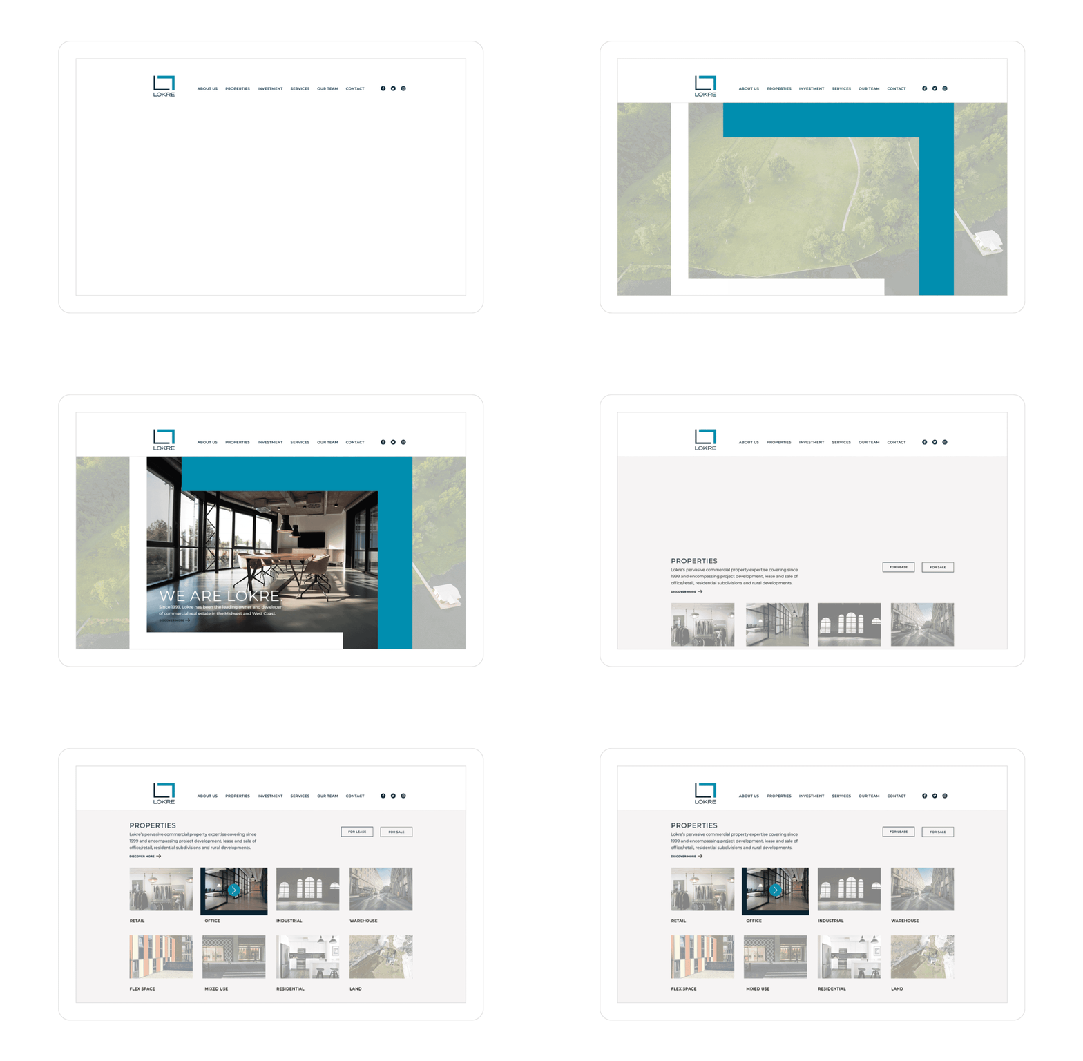
Lokre Real Estate Group is a West Coast-based commercial real estate company. It's a devoted family business that has lasted for many decades, but they wanted to rebrand due to the need for a new logo that would resonate with the new generation.


Mihomi designed a space that resembles a real estate floor plan, with the letter "L" for Lokre symbolizing its unique heritage of prosperity and generational transition. Two major design elements depict this history: two types of "L"s (narrow and wide) and two shades of color (representing the inherited business and new developments).


bottom of page


